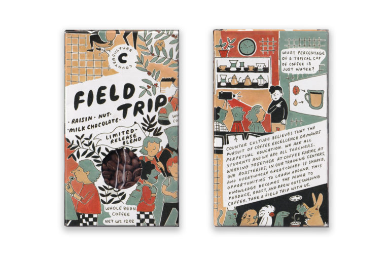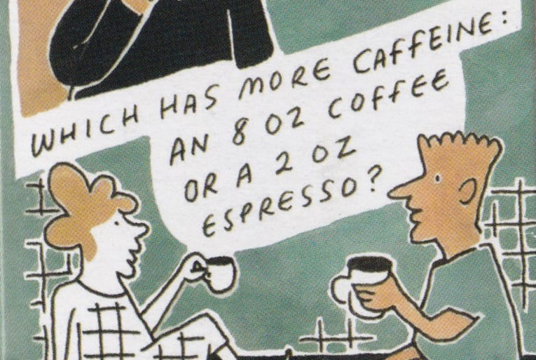
Few coffee packages give us the feeling of a sugar cereal box. When we got our hands on Counter Culture Coffee’s quarterly limited-release Field Trip, we poured over the illustrations, trivia, and whimsy like a child (or adult-child) eating Cookie Crisp before school (or after midnight). We spoke with the Lead Designer Amanda Hakanson-Stacy, who along with Lenora Yerkes created this delightful coffee box.
Why “Field Trip?”
We knew we wanted to create a coffee that highlighted our commitment to education and celebrated our training centers and our up-and-coming online education platform. We spent a lot of time brainstorming names and landed on Field Trip because it’s a fun way to talk about the coffee journey. Field Trip is a celebration of all of the knowledge sharing that happens from farm to cup.

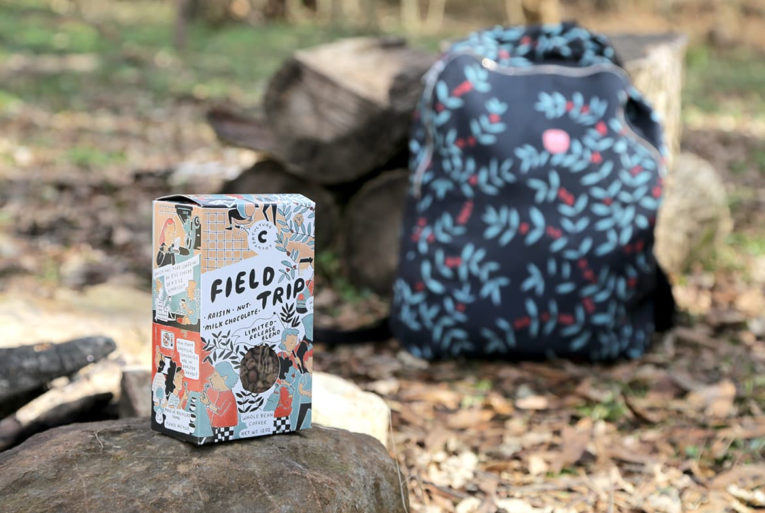
Out in the field. (Photo courtesy Counter Culture Coffee)
Who designed the package?
I collaborated with one of our Sales and Account Managers from DC, Lenora Yerkes, to make this packaging. More information on Lenora and the inspiration here!
Tell us the design inspiration behind this package.
I’ve always admired Lenora’s dedication to her craft—she draws more than anyone I know—and really wanted to collaborate with her on a project. When we started talking about Field Trip, I couldn’t stop thinking about whimsical cartoons and I knew working with Lenora would be a great fit for this product.

Field Trip details.
Why are aesthetics in coffee packaging so important?
Aesthetics are important for all packaging. It’s what draws people to something sitting on a shelf. In a sea of many different coffees, it’s another way for our product to stand out. As a designer, I’m a firm believer in creating a connection between people and products through packaging design. I’m delighted by objects that I want to spend time looking at and displaying.

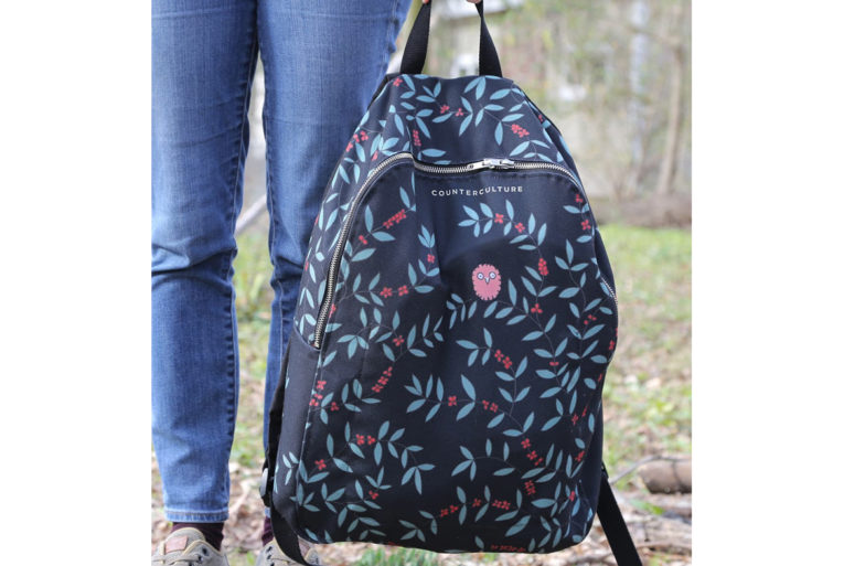
Field Trip backpack. (Photo courtesy Counter Culture Coffee)
There’s also a backpack—is this a part of the release?
It is! You can’t take a Field Trip without a backpack. Lenora drew the art that is on the backpack as well. There is also a limited edition mug.
This was a limited release. What’s next?
This coffee was one of our quarterly Limited Releases.
Spoiler alert—our next quarterly Limited Release is called Kaleidoscope. It is an Ethiopian and Kenyan blend that represents changing seasons, cold coffee, shifting perspectives, and some exciting new products in the works at Counter Culture. The first day to taste (and purchase!) this coffee will be during our Tasting at Ten on Friday, May 3, held at all Training Centers.
Thank you!
Company: Counter Culture Coffee
Location: Durham, NC
Country: United States
Design Debut: January 2019
Designers: Amanda Hakanson-Stacy and Leonora Yerkes
Location: Durham, NC
Country: United States
Design Debut: January 2019
Designers: Amanda Hakanson-Stacy and Leonora Yerkes
Zachary Carlsen is a co-founder and editor at Sprudge Media Network. Read more Zachary Carlsen on Sprudge.
The post Coffee Design: Counter Culture Coffee In Durham, North Carolina appeared first on Sprudge.

