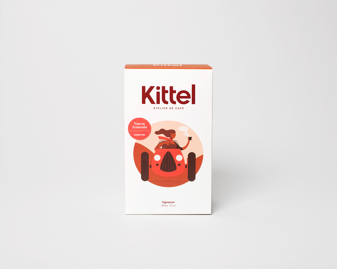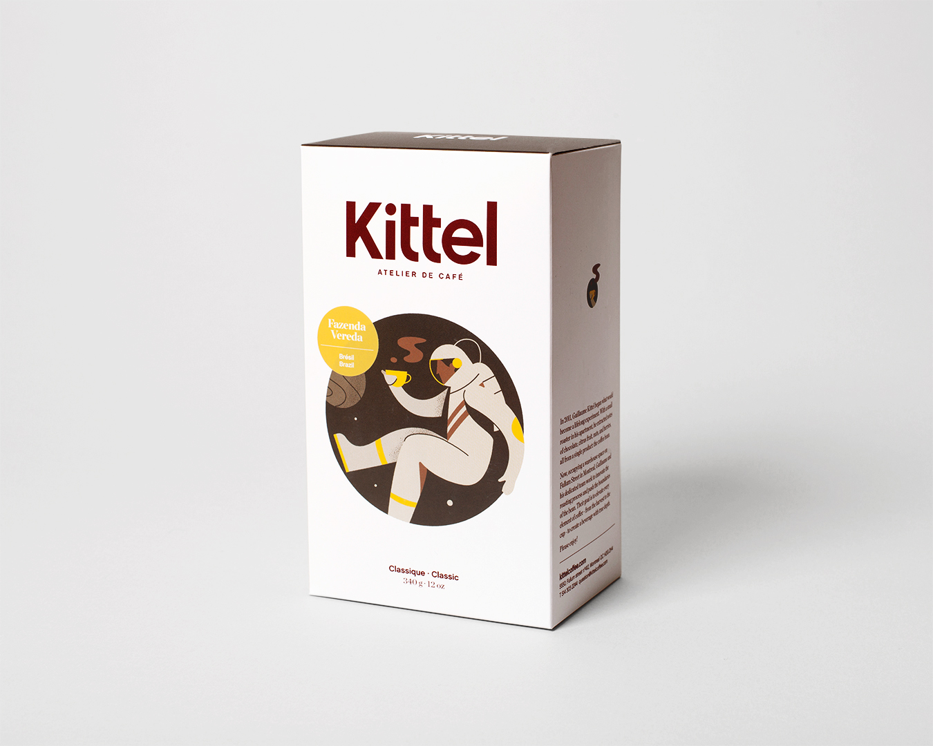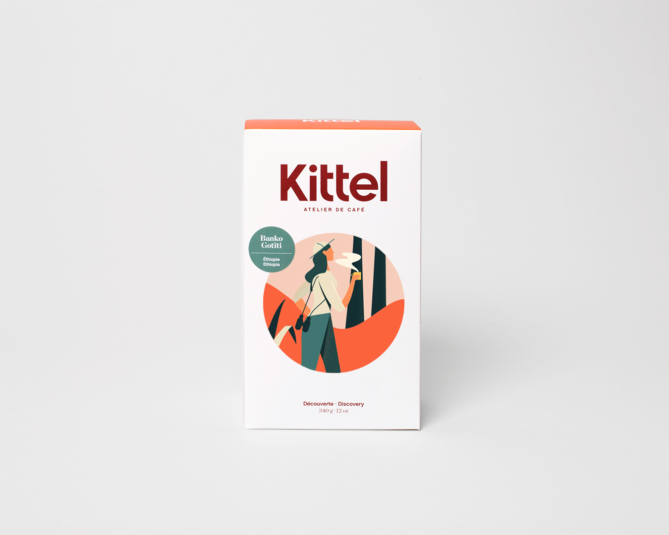
Montreal-based roasting company Kittel revamped their look this year. Going with the popular box packaging, Kittel worked with independent creative consultant Marc-André Rioux along with Dutch illustrator Timo Kuilder to create a colorful line of coffees with a vintage travel poster inspired motif. We talked to Liam Robichaud, Director of Coffee & Quality Control at Kittel, to learn more.
Tell us a bit about your company!
Seven years ago, Guillaume Kittel-Ouimet left his successful career as a financial risk manager and struck out on his own to begin a career in coffee. He bought a small sample roaster, took a course on roasting coffee in nearby Vermont, and in his own apartment he began to experiment.
Now we’ve built a small team and in our humble warehouse in the Rosemont neighbourhood of Montreal we roast coffee for around 60 or so wholesale clients. As a company, Kittel is young and energetic. After years of focusing entirely on the quality of the product in the bag, we were finally ready for a makeover.

When did the coffee package design debut?
We launched the new packaging to select few wholesale partners the week before Christmas 2017, and officially switched over in January of this year.
Who designed the package?
We worked together with Marc-André Rioux, an independent creative consultant who came highly recommended by some of his former colleagues at Montréal advertising agency, Cossette.
It was Marc-André who helped us define our concept of Collections. We wanted to simplify the experience of shopping for new and unique coffees so rather than grouping coffees by origin, we decided to group them by flavour profile, or mood if you will. This allows us to introduce someone who likes earthy, nutty coffees from Brazil to coffee from Peru, Burundi, or Indonesia. Similarly, we can show lovers of Ethiopian and Kenyan coffee, the quality of microlots from Colombia, Guatemala, or Brazil.
So as to avoid over-complication, we limited our collections to the four most commonly requested types of offering:
Classic: Rich, full-bodied coffees, with bittersweet, notes of chocolate and roasted nuts and limited acidity. Perfect for espresso, milk drinks, and a no-frills, any-day-of-the-week cup.
Signature: Crowd-pleasing coffees with notes of fruit balanced with notes of chocolate, caramel, pastry. These coffees are equally remarkable on espresso or filter.
Discovery: Bright, vibrant, fruity, aromatic and even floral coffees to excite the palate and wow your friends. These are the coffees to get for the person who has tried everything.
Decaf: The name says it all. Well just about. We want to source and roast decaf that doesn’t feel like an afterthought. Truth be told, it’s not uncommon to spot us at the roastery enjoying a cup of our single estate Colombian decaf when we’ve had enough caffeine before we’ve had enough coffee.

Tell us more about the art depicted on the coffees.
While Marc-André helped us to define the aesthetic of the new branding, from the packaging to the logo and typography, it was the extraordinarily talented Dutch illustrator, Timo Kuilder who provided the imagery on the front of the boxes.
We knew that we wanted illustrations that were inviting, familiar, and timeless. This is why the style might be described as vintage or retro. There is an element of travel posters from the early 20th century and a touch of cartoons from the 80s. Each image focuses on an individual, in the midst of some event that is objectively exciting but in spite of their unique surroundings, all they can focus on is their cup of coffee.
Why are aesthetics in coffee packaging so important?
For us as the roaster, aesthetics are secondary. For years, we roasted coffee and put it in plain white bags with our name and some info about the origin. Quality is what’s important to us: quality of the product we source, and quality of the roasts we serve to our customers.
With that being said, there is another factor to consider. How do we introduce ourselves to new customers. If someone hasn’t had a chance to taste the coffee yet, they’re going to judge it the only way they can: visually. Through the process of this rebranding, we have learned that aesthetics are very relevant, and we are so proud to hear from customers that they love the new look.

What type of package is it and where is it manufactured?
When we set out to do this rebranding, we knew that we wanted packaging with as little environmental impact as possible but we were not willing to sacrifice customer experience. It had to be engaging, beautiful, easy to display, and yet still be able to be reused, recycled, or even to break down and return to the earth from which it came.
Only one option consistently stood out from the rest: boxes. Boxes stand straight up, they stack easily and in an attractive way, making them perfect for retail displays at our partner cafes and stores. And what’s more, even the most beautiful boxes could be made from recycled materials and be themselves easily recycled. Our own boxes are produced here in St-Hyacinthe, Quebec, at Imprimerie Dumaine. They are made of FSC certified cardboard and printed with vegetable based inks.
Inside the box, we still had to use a bag, and so we knew right from the start it had to be compostable. We worked together with TekPak, a Canadian company making their own brand of Omnidegradable coffee packaging. With their help, we were able to procure 100% biodegradable bags (even the valve). Combined with our recycled and recyclable boxes, we felt that we were finally able to meet our goal of a product which is both sustainable and memorable.
Where is it currently available?
Currently we are available at numerous shops around Montreal and the surrounding region, and we’re starting to be offered at shops in other provinces. Better still, customers all across Canada can order online and we ship for free on orders of $30 or more.
We are also beginning to hear from cafes in the US that want to partner with us, so you may begin to see us on that side of the border.
Zachary Carlsen is a co-founder and editor at Sprudge Media Network. Read more Zachary Carlsen on Sprudge.
The post Coffee Design: Kittel In Montreal appeared first on Sprudge.

