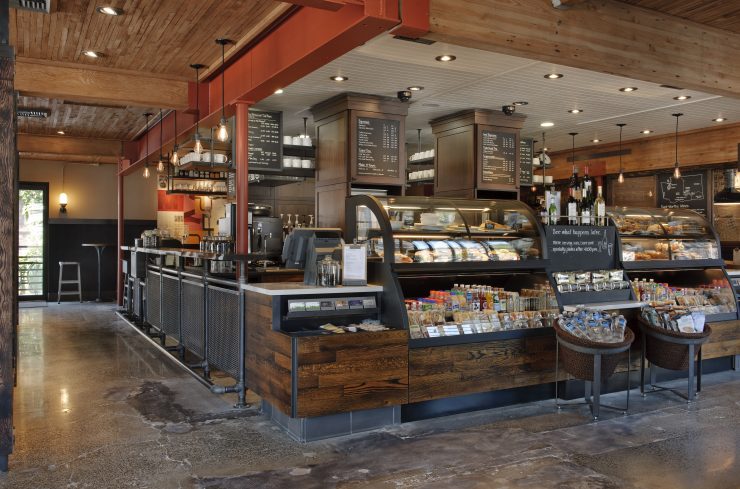
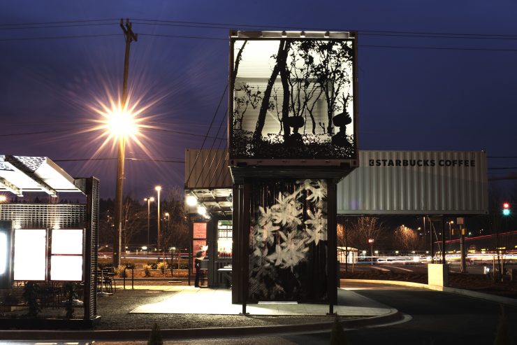
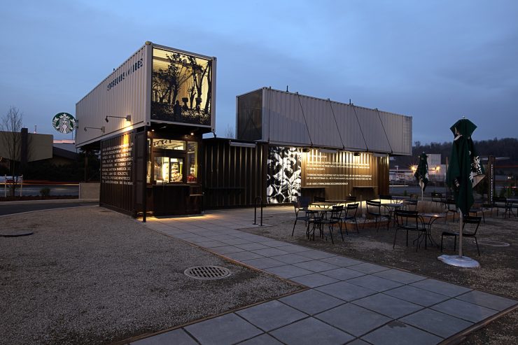
At the 2014 Specialty Coffee Association of America Symposium, Starbucks Design VP Bill Sleeth delivered this talk on the brand’s international design efforts, and we were captivated by the imagery. Could it be that Starbucks—makers of cookie-cutter suburban sprawl cafes and endless duplicate grocery store kiosks—were also creating some of the most beautiful coffee spaces in the world? Sleeth’s talk suggested yes; the launch of their Reserve Roastery was still several months away, but we knew they’d acquired the spacious former Packard dealership on Pine in Seattle, just up the road from the Symposium event.
Wheels started turning. Introductions were made, and before too long we were given an extraordinary opportunity to interview design leaders within the company, including Bill Sleeth himself.
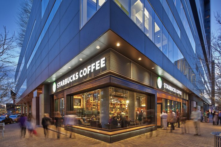
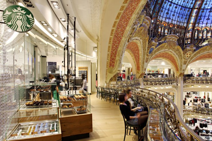
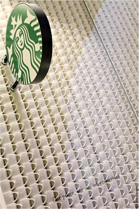
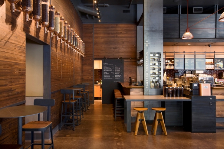
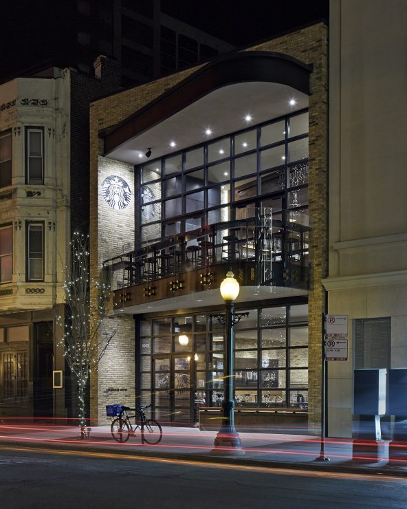
The Starbucks Reserve Roastery in Seattle is not the brand’s first aesthetically notable cafe. Over the past few years, a global team of Starbucks designers—more than 300 staffers (or “partners” in Starbucks parlance) total, across 18 different design offices—have created a series of one-off cafe showpieces in markets around the world. Many of these cafes are undeniably stirring: the soaring glass and big city bustle at Oak & Rush in Chicago, a no-nonsense spin on Dutch history and modern design in Amsterdam, a seamlessly integrated symphony of cups at Galeries Lafayette in Paris, the dusky, evocative earth tones and unconventional seating in Mumbai; and on and on.
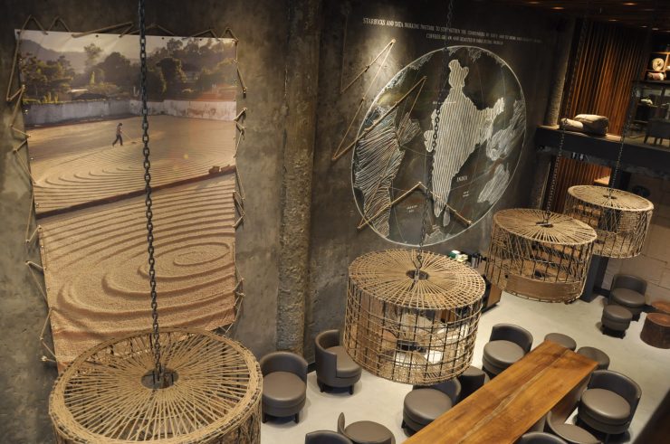
One of the seating areas in a New Delhi Starbucks.
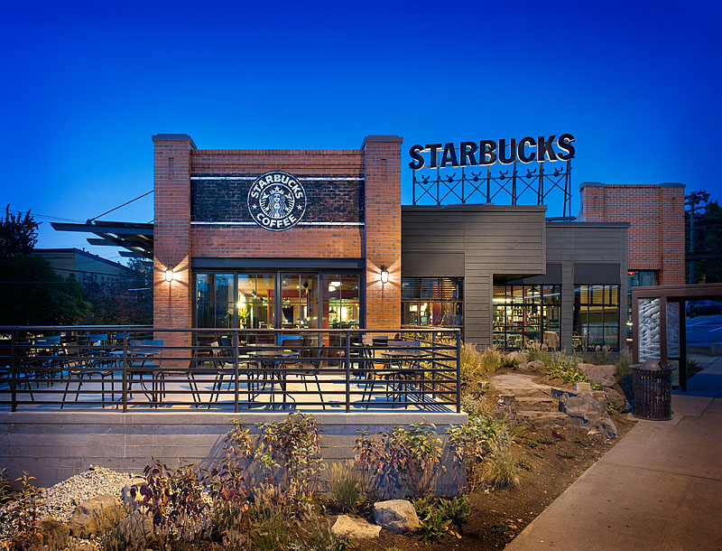
Whatever your feelings are on Starbucks’ coffee offerings, the brand is undeniably a design powerhouse; with offices in cities like Miami, Seattle, and São Paolo, they’re the single-biggest cafe design firm in the world. To learn more we sat down with four principals: Bill Sleeth, VP of Design for the Americas; Andrew Bello, Managing Director of US Design; Haley Drage, Director for Global Communications; and Anthony Perez, Director of Concept Design.
We haven’t always been kind to Starbucks on this website, but Starbucks was kind to us, exceedingly generous with their time and insight into what we consider to be inarguably some of the most beautiful cafes in the world. As with all things Starbucks, there is a duality here: while your neighborhood cafe may not boast a living wall and enormous mural, the lessons learned at these flagships trickle down into decisions made in smaller shops; and because Starbucks, the brand and cafe experience, is so literally woven into the fabric of cities around the world (and especially in America), what we’re talking about here is more than just design, but rather, the wider context of modern urban life.
This interview has been edited and condensed for clarity.
As a starting point, give us an overview of the mindset that goes into cafe design at Starbucks.
Bill Sleeth (BS): Just take it as an academic question for a second. There are different kinds of corporate approaches to the retail world. One might be heavily customer inclined or consumer insight inclined; some brands try to build their brand around what an insight says. If you look at Starbucks, we’ve never done that. We make our own determination and put it out there, and then we take that feedback.
We say we have a strong consumer mindset but it’s nuanced. We want to provide something that people are comfortable with, but most people aren’t designers. [People] don’t create cafes, and they don’t know something is great before they see it.
You tweak it, you design it, you get feedback. It’s a feedback loop. If I loosely term the word research, it’s constant feedback. We do a lot of stores. We have a lot of opportunities to see what’s working. But after hundreds, if not thousands of stores, you get a feeling for what works and doesn’t. I also have an informal way of gathering data—people hear you work for Starbucks, and they want to talk to you about Starbucks.
I like going to other coffee shops to see what they’re doing. Sometimes I walk into a space that I absolutely love, I could hang out here all day, but I wouldn’t do that design for Starbucks. I try and moderate my own personal preference in the whole thing. I think there’s something called the brand that’s outside of me. This brand is something that our customers hold in their mind. That’s the place I try and play in.
Talk to us about some of the other cafes that have influenced how you think about cafe design.
BS: You cannot underestimate the power of what I’ll loosely call the DIY movement around restaurants and coffee shops. There’s a lot of good design coming out of people’s heads that may or not be designers. The design they’re doing—it’s a simplicity, a kind of elegance. They may not be designers, but you see things that are breakthrough, but not sophisticated the way a designer would define it.
I have a lot of respect for that movement. It’s burgeoning and inspiring in a lot of ways. Architects have been talking about this for years, but it’s the local restauranteur turning it into something magical.
Anthony Perez (AP): I completely agree. It’s basically going and figuring out something from their brother’s place. They got a couple of things in the backyard and they want to turn it into a bar. There’s something magical and pure about that. It’s raw.
Andrew Bello (AB): When you’re working with a designer, a professional designer, there’s going to be an interpretation. The raw inspiration of an individual is ad hoc. It’s pure, it’s through them.
And under budget constraints.
AP: Yes! It’s the mother of invention.
BS: To me, the best ones are rooted in a neighborhood. Places that really elevate the architecture. The La Colombe in New York City in NoHo I think is beautiful. The new Sightglass in the Mission, the way that space moves, it’s so nice in there.
I appreciate it but I don’t know how much it is applicable to Starbucks because these are theater spaces.
Let’s start talking about specific shops. For starters, your space on Canal and St. Charles in New Orleans.
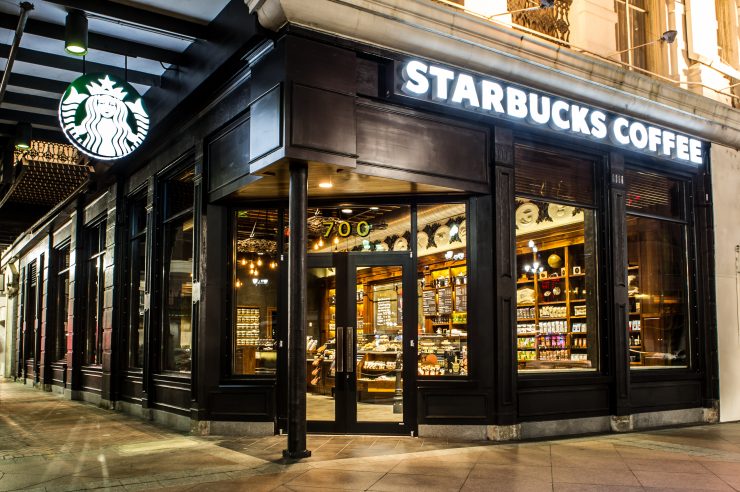
BS: The New Orleans store, Canal and St. Charles — what we talk about is, we talk about coffeehouse design: residential, hospitality, retail of course, because we have a retail element. Our inspiration is, we’re making a coffeehouse, so residential is always a part of it. It’s more akin to a restaurant or a cafe: not as formal as a formal dining experience, but there’s some formality here.
AP: To me that’s as much culture. The rooting to the place: walnut, hospitality, formality. That’s the American South.
BS: We created a classic bar and design that we felt was iconic. The upstairs has been around for hundreds of years and was a gentlemen’s club in the traditional sense, called ‘The Pickwick Club.’
AB: This was a project that was successful in a way that if you ran through the interior and didn’t know where it was, you could guess where it was. For that to come through through the lens of the Starbucks brand, you can feel it’s a Starbucks but also it has a sense of place and belonging.
It’s not just a coffee story, it’s a local cultural story as well on many levels. We want to resonate not just with the locals but the tourists as well.
BS: For the same exact reason I like the Starbucks on Canal Street is why I like that La Colombe in New York. We clicked into a headspace where we were architects wanting to restore this building. There’s a lot of historical reference in her but it also feels modern.
AB: The buildings that tend to occupy “Main and Main” tend to be pretty good buildings. The whole idea of being culturally relevant — if it’s existing, a building hasn’t been knocked down, there’s history in it. You can touch it and feel it.
Talk to us about The Bank in Amsterdam. What are the factors are play here when you think about seating? Are there cultural considerations? Are you thinking about how Amsterdammers drink coffee? And how does that get reflected in this cafe?
BS: Liz Muller designed this store, and she’s Dutch. But I would just say in big ways, [Amsterdammers] drink coffee like how we drink coffee. The biggest differences in how people use space come up when you think about places like China and Brazil. People in those places tend to come to our cafes in big groups, like at least 3-4 people at a time in Brazil, and they grab a table first before they go get in line. In the United States, we don’t do that, nor in Amsterdam. In China, it’s a whole different consideration because large groups are very common—8 or 10 people in a group at a time coming in to the cafes.
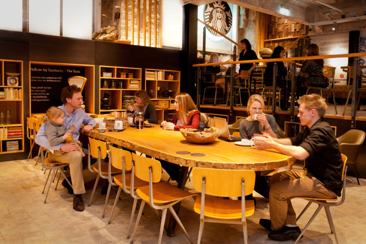
The Bank is really driven around how the community uses space. There is some element of turning lemons into lemonade; it’s in the basement of a building, and we wanted to create something dramatic out of that.
This was our first cafe in Amsterdam. We’re roasting down the street [a few miles away], so we wanted this to be a kind of epicenter for what we stood for as a brand. This could be something that could show up as a stake in the ground for our beliefs. There’s some coffee story here, a depiction of how we think about the brand. This is how we think about roasting, and by the way, we roast here in town.
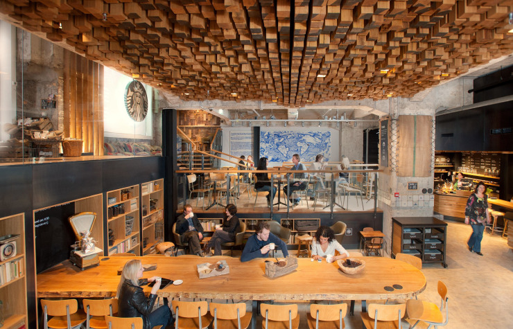
AB: All the lighting [in the ceiling] is the same size as the wood, so it fits in. It does help with the sound and baffling.
BS: You’ll noticed live edge wood tables with slices. Liz Muller really wanted to provide something that locals could relate to. There’s wooden molds made out of designs that Dutch people know from this brand of cookies…and that echoes a cultural norm in the Netherlands, which is cookies & coffee as a pairing. That’s a story anyone can understand, and you can get our coffee and eat those cookies in the store.
There’s also an element here of what role the Dutch played in the history of coffee. There’s a map made out of Dutch tile that tells that story. She found these tiles stacked in the back of an old tile factory, and she said, “I want those tiles.” There’s something very iconic about them—very Dutch, but not in style.
AB: What’s interesting about that wall mural, and the connection back to Canal Street, is that she’s telling a coffee trade story that’s relevant to that country. In New Orleans, we tell the same story: it was the heaviest [green coffee] import port for the whole entire country. So in New Orleans, there’s a mural with the siren and the port. It’s a kind of storytelling.
BS: We believe that when we can express the hand craftsmanship, we really should. We can’t for every store but when we can we do. I argue as a leader here that we should do more of this.
AP: It’s beautifully imperfect. It feels handmade, because it is.
AB: It’s the little things. It’s about an expression of craft. Every store should feel that craft, but stores like this you get to dial it way way up.
BS: Right now we have 750 LEED-certified stores. We’re one of the world’s largest LEED-certified companies. This is a very sustainable activity; making the thing by hand, on site.
Next, tell us more about the space at Galeries Lafayette in Paris.
BS: This was designed by our team in Europe. They had an idea they wanted to express which was to say, let’s take a simple idea and express it and use it as a main generator. That is expressed by the white cups that form the face of the counter and show up on the wall.
It’s on the edge of one of the galleries of the building. There’s also a little bit of…treating the coffee as a precious object. It made a lot of sense in that location—we’re not going to roll out a museum case look for all our stores, but yeah.
I can compare that one in Galeries Lafayette to our store in the Louvre, which has kind of a different take on design featuring fresh oak, fresh marble, and more integration of the Starbucks espresso cups.
What are some of the new flagship stores you’re most excited about recently?
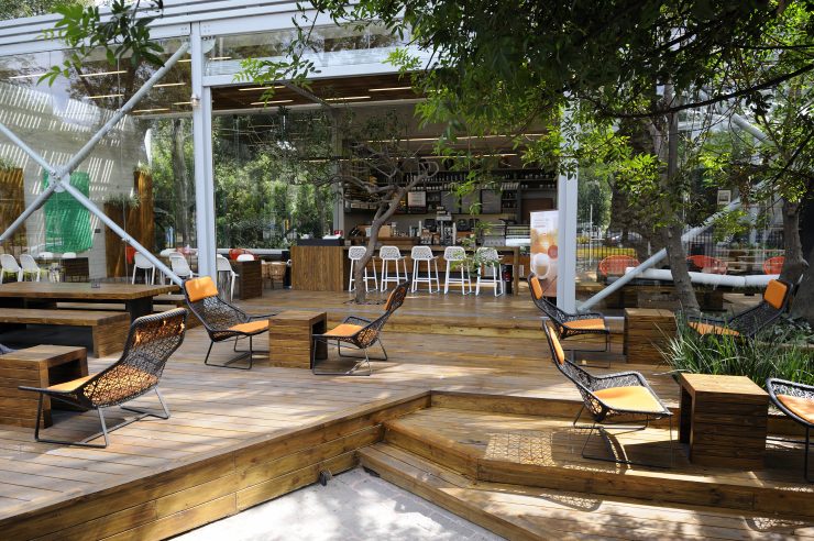
AP: For me, it’s Chapultepec Park. Mexico City is huge, enormous, and the park is enormous, and the building was already existing. So there’s this idea of insertion, the idea of an engine—the insertion of an engine into the glass box—but the rest of it is dissolved into a space that’s indoor/outdoor.
I find this driving for me on a number of fronts, because it makes me ask: How do we push nature in? How do we push the cafe out? The sense of oxygen and air, the light coming through the dappled leaves—it’s a diaphanous space.
This is way outside the normal catalogue of furniture, right? How long ago did this cafe open?
AP: That’s right.
AB: About 2 years ago.
Were there a lot of architectural inspirations for this cafe from around Mexico City? Is that inside/outside feeling something that’s common?
BS: Well, I would just say, this was one of those once-in-a-lifetime projects. This was originally just a park structure. People were hanging out in it. The park wanted to turn it into an amenity, and so that was the stroke of genius, on behalf of the city itself. It was their idea to get a retailer to come and turn it into something. And what an incredible opportunity for us.
Once we got into it, we recognized that we were all trying to say, “What does this remind us of?” Because it’s kind of like a kiosk…and those big doors open and close. It suggested a kind of blurring of inside and outside.
Architects, especially in the Pacific Northwest, we dream of having walls that disappear. In the winter, we want a small close place, but in the summer…you want an outdoor kitchen, an outdoor living space. We did the same thing in Disney Anaheim.
AB: One of the projects that stands out to me is Austin City Limits. It’s not as obvious that we would do that project in there. I love Disney…and maybe I’m biased when it comes to the Sunbelt region because that’s what I used to run.
In Austin, we’re attached to having this space in the W Hotel, and music is deep in the roots of Starbucks. We produced music as one point in the brand’s lifetime. So pulling in something that was meaningful, not just for someone going to a music festival. You have to fit in; you will be called out if you aren’t relevant.
How did you speak to that?
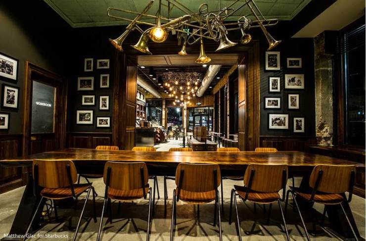
AB: We have many elements in there. The restroom vestibule is plastered with music posters. We have the lighting theatrically inspired, like the kind of lighting you would see in a music venue. There’s a chandelier made out of microphones. The State Street Bridge [an iconic Austin landmark] is nearby, and we have a huge carved mural of the bats flying out underneath the bridge. One of the art pieces on the walls above the merch is a made out of plastic bags, which reflects the ban there in Austin. Coffee is really big in Austin.
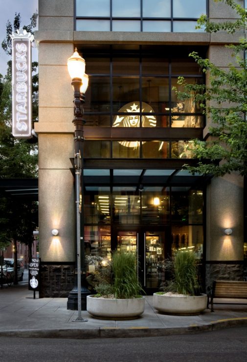
Tell us about the Brewery Blocks store in Portland.
BS: [That cafe] is a moment in time for us. You need to go back 2.5 years ago. There was a team that got the opportunity to design some stores, and this is one of them. A breakthrough moment for me was, I walked into the store, and I looked around, and I saw these schoolhouse chairs that were from outside of our normal furniture catalogue.
I pulled the designer aside and said, “Hey, you’re designing a store and you aren’t using [the catalogue]? Why not?”
And the answer was—well, to paraphrase, the answer was, Starbucks at its very best is eclectic. Sometimes you need to think about a store in a way that makes sense. That shop was a moment of trying to articulate this notion of like, mass customization, but also staying globally relevant and locally relevant.
And I said—how do we recognize when to do that, and what are the filters for determining when? And if not easily done, how do we decide when? The idea is that we create a catalogue of furnishings, the classics that don’t change often—we used to develop a concept and let it live for 5 years, but now 20% is always changing all the time. It’s happening in the Americas now but it’s becoming global.
What was the Brewery Blocks space before your cafe there?
BS: This was an Adidas spot, and before that it was a Weinhard’s brewery. A developer came in and essentially preserved the original buildings but built new buildings. It’s got residential above and retail on the ground floor, and it pulls off the back of Powell’s Books.
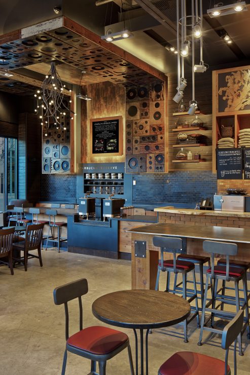
There’s a kind of industrial nature to this location. It’s very simple: we created a store that drafted off that simplicity, taking some of those design concepts and expanding it further. Reclaimed wood has become the wall wrapper. We experimentally did beer and wine here, not a lot, just a little. This was also the first store we were really grappling around creating synergy between Clover coffee and the Reserve program.
I felt like it was really unique and one of our first elevated Clover expressions. Times Square also has a Clover bar, but it was more like taking it to our roots—you get served separately there and it’s more touristy.
The thing that was interesting about this solution to Clover & Reserve was that it was integrated. I can turn to the side and serve Clover, and I’ve got a back bar.
How do you communicate a design concept like that to staff [“partners”] in the stores?
BS: We have this thing we call “The Triad.” It’s an interrelation between design, construction, and ops. Those teams work on every project—there’s design review and operators that look at every plan, and since they know the customers well, they look at it and say, “Oh, we need more soft seating” and the like. This way we’re not opening a store with a bunch of hard seats when a customer base is primarily retirees.
And that operations team sees it through to the training of the partners?
BS: Yes.
AB: We also educate our partners as to what and why we did things in stores. Ideally, this gets communicated because the operators at a regional level are on the journey with us, but that can go away after a while—we’ve gone as far as to leave a printed narrative behind. Partners come and go, things change, but something like that, the story, stays the same.
BS: For our New Delhi store, we actually did tours with our partners. We brought everyone in all at once and explained everything, and then put something in writing for when the customers ask. It gives them an opportunity to talk about coffee.
Haley Drage (HD): Our customers & partners often come from the neighborhoods [where the cafes are located], so that’s part of it too.
Talk to us about the Oak & Rush cafe in Chicago.
BS: Prada is right next door, then a Gucci store and all the usual suspects, but there’s a real story here for us, in this location. This was remodeling the first store east of the Cascades. This was our proof for, do we have legs beyond the Northwest? That’s a lease that Howard [Schultz, Starbucks’ CEO] signed, that first lease, and for me, I was new, so it was sort of like my opportunity to show I could bring value to the company.
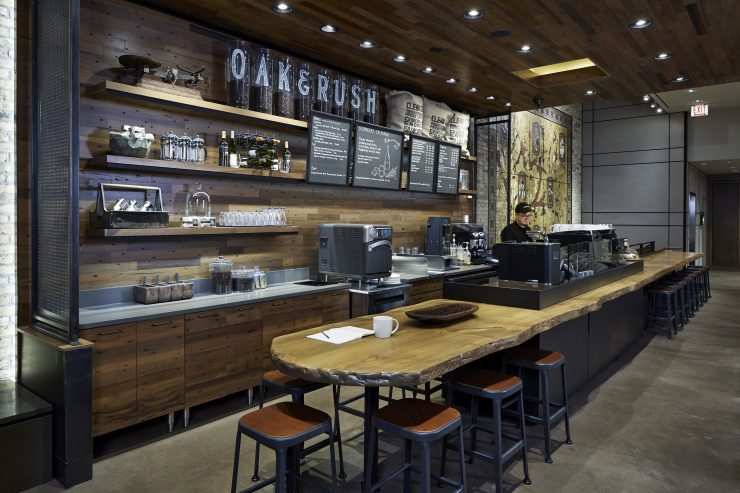
Jill Enomoto is the director in our NY studio, but at the time she was a designer. Oak & Rush opened 2 years ago. So you talked a lot about like, at what point do we really push? Downstairs there’s also a Clover machine, so you get an entire experience, but you go upstairs, and this is what you get—one long piece of live edge wood that kind of wraps around a Nuova Simonelli and some really fantastic equipment, another Clover and the grinders and such. You can sit around and be like elbow to elbow with the barista. It wraps around.
At Starbucks, we want to have the barista facing you with the machine there, but this is an opportunity to get in behind and see what’s going on. This pushed us as an organization. And no, we aren’t rolling out manual espresso machines across all of our cafes.
Tell us more about having that difference service model upstairs.
BS: We believed in the sophistication of the local customers. It’s a shopping destination, off Michigan Avenue, but the residential there is very…let’s say upscale. We felt we could provide this experience to the customers. What we’ve proven to ourselves is that it actually does work.
We did this really long Chesterfield couch which we think is so cool. It’s all tight, very urban–it’s Chicago, right? That’s how it feels. We put a fireplace in, for when it gets cold in the winter. But it’s also informal; because of the layout, and how close quarters it is, I can walk over and say: “Hey, have you had a cup of coffee?”
They’re experimenting with it. If we can try stuff, we’re going to try stuff, but if it’s inappropriate, we won’t go further.
So these stores are laboratories for not just design, but for operations. Anything you play with in a concept store, you might someday integrate into the wider design?
BS: I love the idea of incremental integration. I’ve been in concepts for my entire life, and if you ivory tower a concept, you go off, you concept it, and then you try it. But we’ve been doing cafes for 40 years—I think making an incremental adjustment and then just doing it, trying it, that’s a way to go forward.
HD: There’s always going to be that tension based on offerings and customers, and here, between the upstairs and downstairs. We’re always trying something—a lot of times it makes the most sense in Seattle.
AB: It’s informal. We’ll try things different places, and see where it goes.
BS: The bigger question is, the impact of this stuff on the partners. We often focus on the customer—the easiest thing to say is that we’ll never do anything to harm our partners. We ask, can the partner use it? Is it safe to use? Does it help their experience of working in the store? That does play into the conversation—it tends to come during the trial period. We try and absorb the learning and not make that mistake again.
But for Oak & Rush, say, we look at the labor model and take their feedback.
So what has that feedback been like for Oak & Rush?
BS: Oh, upstairs, I think they love it. It’s like they’re holding court. We gave them a Ferrari…we bring our coffee masters there and they love it.
We also want to ask about a personal favorite Starbucks store, the spot on Olive Way in Seattle colloquially referred to as “Gaybucks” [We’ll note for our readers that this name is like a slang grassroots Seattle thing based on Capitol Hill’s status (currently in flux) as Seattle’s Gayborhood, not an official Starbucks name or in any way approved by Starbucks].
We’ve just frankly always sort of loved this store, and have been aware of its cultural place and allure in Seattle. Talk to us about it.
BS: The shop underwent a huge remodel in 2011, after earlier renovations. The space was originally a house, and then it was a Red Robin I believe, before we had it. From an operator standpoint, this is the most radical store we’ve ever done. The layout reminds us a bit of how service works at The Mill and Four Barrel in San Francisco.
We didn’t end up making this something we’d go forward with [at other stores] for a variety of reasons, but we’re very proud of this store. If you compare this to the Intelligentsia in Logan Square (which is almost like a diner), the idea was all about customer connection. We wanted to create a better connection, more synergy, but there was also a real belief that it would be faster.
I don’t believe it actually wound up being faster. but now it’s in our lexicon and if we needed to do it again, we could say do this and modify.
But did you hit your goals for the space itself? More connection and flow?
BS: Yeah…I don’t know how to explain it. The history of this space…I think they wanted to create something that feels like it belongs to the neighborhood. We think the cafe originally opened in 1995? 1996?
We were teenagers then! For us that shop has always been there.
(group laughs)
How do manual espresso machines get brought in? Like the Nuova Simonelli at Oak & Rush, for example.
BS: When you think about it at scale, there’s so few. We have thousands of stores and very few have manual machines. And there’s no Starbucks that has only manual in it.
HD: There’s that tension again. Think about expediting that service and expectation, while feeding that continuity. To me, it’s an evolution of where we began.
Where is Starbucks trying to go next in terms of the coffeehouses you’re trying to create? These tentpole cafes—will they ultimately influence your thousands of other stores? Can we expect more manual machines?
BS: From a customer experience standpoint, and product offering mode of how we make it, it’s related to some of the other statements you guys have made—you talk about how you react to our machines vs. how the vast majority of our customers would react.
We want to make the right decisions and we want to evolve and innovate. It’s a careful dance; we’re not going to just throw X machine in there that’s state of the art without bringing our customers along or understanding what’s the right move for us.
We are going to go where our customers go, certainly, and it would be easy for us to agree.
And those tentpole stores?
BS: We don’t just invest in a store as a kind of marketing statement. We have the same performance criteria for every single store we do, and we invest in ones that we think will do high numbers.
So there’s less of these stores—but we do innovate up here in one or two stores that are more high profile, and then we want to extrapolate from that and figure out what we want to do in more stores. We look at the concept stores and say, ‘Can we start to use that and incorporate that?’
HD: As the customer evolves, we’ll be able to understand that. If the customers moves, we will move.
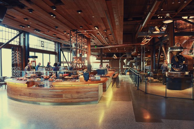
Inside The Starbucks Reserve Roastery in Seattle. Photo by Zachary Carlsen for Sprudge.com
So where do you see customers moving? What are some of the things on your radar now that indicate where you think your customers are going?
BS: We have a passion about some particular things, and we want to be able to express that to our customers…with Gesha coffee, for example—we want to show our customers they can make this coffee themselves at home. The Clover is a fantastic machine but it doesn’t drive at-home coffee. We want to move the needle on specialty coffee. We want people to understand what we can do at the higher end of these unique coffees. So that’s something you’re asking me: is the customer going there? I’m not sure. But we want to take the customer there.
HD: The way I think about it is, it’s on this spectrum. Where do we need to expedite? Maybe it’s a commuter cafe. And then the other end of the spectrum, [we have] places where people can really stay and communicate. And we’re able to do that. We touch the customers in multiple ways. We’re not singular. The flexibility of being able to sit and experience a space is very analog, but there’s also digital integration, like POS ordering. We’re meeting them where they are.
All photos courtesy Starbucks except where otherwise noted.
Alex Bernson contributed to this reporting.
The post Inside The Global Design World Of Starbucks appeared first on Sprudge.


