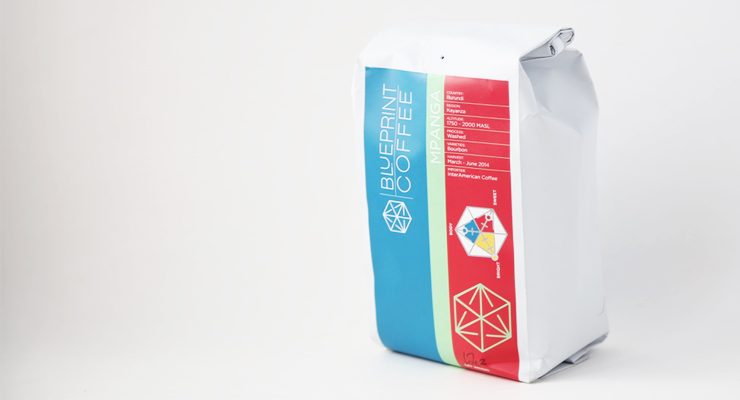
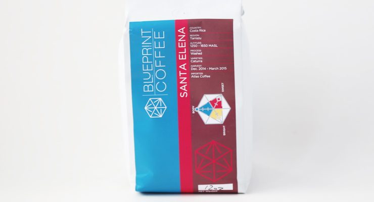
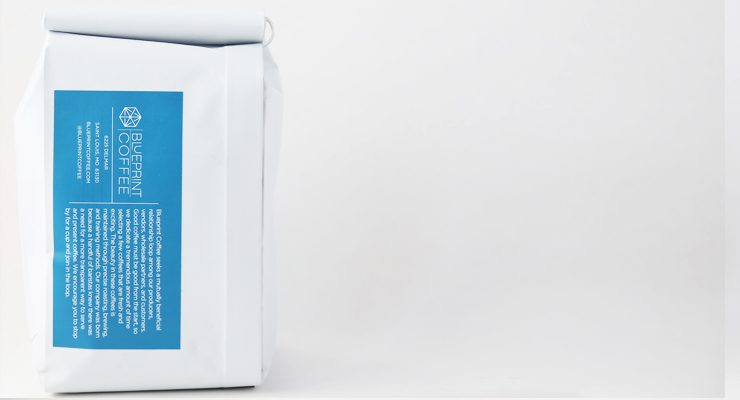
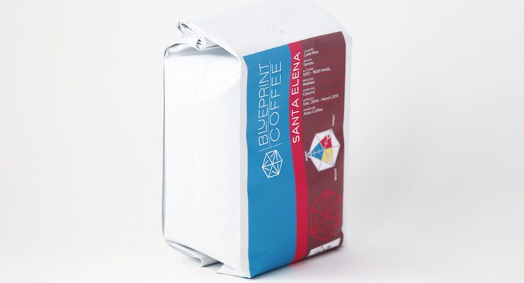
Blueprint Coffee’s distinctive design belies their intentionality as a specialty coffee company. Produced in collaboration with the St. Louis creative agency Giant Hat, it’s coffee packaging in a style both uniquely Blueprint, with a color scheme that’s modular between different coffee offerings. They’ve taken a measured approach to flavor notes and visual representation, but they’re also one of the few specialty coffee roasters to openly list their green importing partners on each bag of coffee they sell—a practice we think is both honorable and educational for coffee drinkers.
As told to Sprudge by Mike Marquard.
When did the coffee package design debut?
We released our packaging design in conjunction with the opening of Blueprint in September of 2013.
Who designed the package?
It was a collaborative effort between Blueprint Coffee and our creative agency, Giant Hat. Our entire team was critical in developing what pieces of information we wanted to put on the label. Kevin Reddy of Blueprint and Karl Eggers of Giant Hat were the minds behind the Blueprint Cube. Karl, Kevin, and I really led the charge on the layout of the front bag label.
Any design highlights you want to share?
We have both a light and dark Pantone for each “color” we use, so two blues, two browns, etc. The Blueprint blue is most often 314c, our darker blue. We use Gotham as our main typeface, with some slight customization in the “Blueprint” typeface.
Please describe the look in your own words!
All of our looks and cafe design revolve around the Bauhaus style. We use functionality to guide our design. Our label does this by conveying the critical information a consumer or wholesale customer may be looking for about the coffee and our company and stops at that. Instead of using wordy descriptions, we use colors and our “flavor cube” to describe the coffees. For offerings that are more caramelized and chocolatey in flavor, the main color on the bag is brown; for floral and citrus-forward offerings you’ll find yellow, and for juicy and red-fruit style coffee you’ll find red.
Our flavor graph gets past the whole “roast level” slider employed by so many roasters in the past and uses a simple scale to rate the presence of sweetness, body, and brightness found in a cup. Usually, customers navigate to new coffees in our offerings by those main identifying colors while a more curious or frequent customer may start to use the flavor graph to find exactly what they’re looking for.
What coffee information do you share on the package? What’s the motivation behind that?
We try to state the facts that may influence flavor or customer preference: altitude, variety, and region. We then provide importer and harvest information as a reassurance that the coffee is fresh and imported with care. We depend on our middle-people to make sure trade is fair and sustainability is a focus.
Where is the bag manufactured?
It is a foil-lined side gusset bag in matte white sourced through Pack Plus in California. It has a standard one-way valve on it.
Nice Package is a feature series by Zachary Carlsen on Sprudge. Look at more nice packages here.
The post Nice Package: Blueprint Coffee of St. Louis, MO appeared first on Sprudge.


