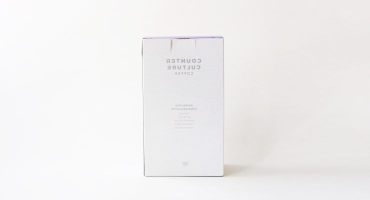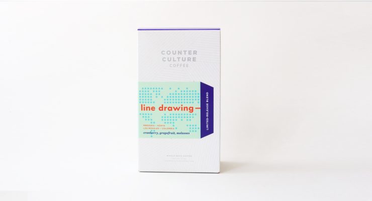
Packaging is a great way to distinguish your brand, and, in the world of progressive coffee, some of our favorite design work happens from in-house creative teams. That’s long been the case for our friends and partners at Durham, North Carolina’s Counter Culture Coffee.
In 2014, the brand went through a visual refresh, featuring a new look for packaging and fresh names for many of their coffee blends. The project was overseen by in-house designer Katie Parland, whose work encompasses a series of limited-release seasonal and holiday blend offerings from Counter Culture. Their latest, dubbed Line Drawing, makes for an undeniably nice package.
As told to Sprudge by Nathan Brown.
When did the packaging for Line Drawing debut?
We’d been interested in trying out a box package for a while and finally did with our 2013 Holiday Coffee. For that project, we were lucky enough to work with McKinney—an advertising and branding agency in Durham that’s done huge campaigns for major national brands. The 2013 Holiday Coffee was very well received.
Early last summer, as we were beginning to think about our 2014 Holiday Coffee, coffee buyer Tim Hill came to the marketing department wanting to start a series of limited-release seasonal coffees analogous to small-run seasonal beers. We did a trial run of that concept last summer—not in a box, but in our then-standard foil-lined bags—with a coffee called Equilibrium that combined coffees from Kenya, Ethiopia, and Guatemala in equal amounts for an intensely complex coffee. Equilibrium as a concept went extremely well, so, building upon that, we brought the concept together with the box package and somewhat-officially launched our limited-release series with our 2014 Holiday Coffee. Each coffee in the series is available for a couple of months at a time, and we try to make sure that we always have one available—though there are occasionally short lapses between them.
Early this year, we followed our 2014 Holiday Coffee with a blend called Underdog, which combined coffees from lesser-known origins. After that, we had a throwback single-origin selection—our CCCXX 20th Anniversary coffee—with a flavor profile reminiscent of coffees from our distant past. And, currently, we have Line Drawing.
Line Drawing debuted in July. The concept behind the blend reflects re-thinking how we work sustainably in the places where we buy coffees—with a focus on Colombian and Kenyan coffees. We were expecting this to be around for several months, but it’ll only be available for a few more weeks because it’s been fairly popular.
Who designed the package?
The box itself and the labels for each limited-release blend were designed in-house by Katie Parland. Katie oversaw the comprehensive re-brand we did last year.
Any design highlights you want to share?
I’ll let Katie Parland share in her own words:
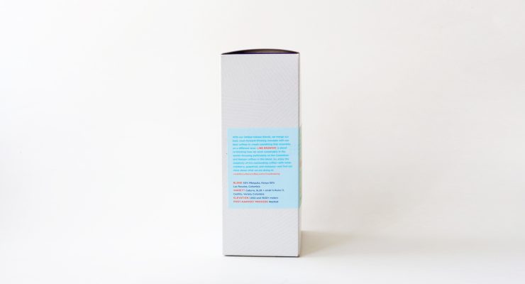
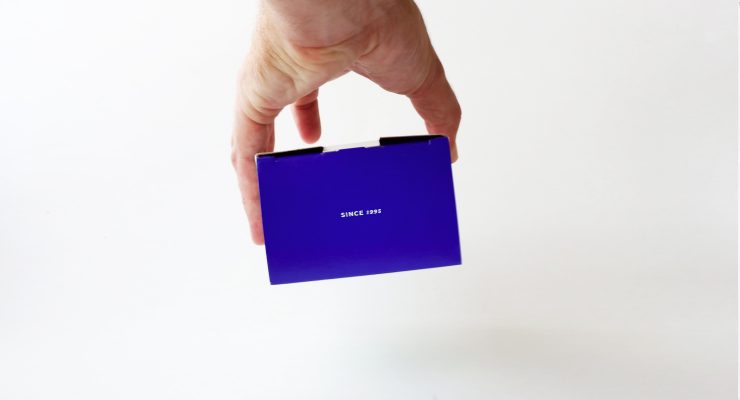
“We wanted the box to act as a neutral-enough platform for a variety of unique labels. The design is subtle, but when you look closely it is quite intricate. Metallic ink allows the pattern to recede or pop depending upon how the light hits. The block of blue on top ties it in with our single-origin packaging, and a flood of color on the interior is a nice surprise.” –Katie Parland, Graphic Designer, Counter Culture.
Please describe the look in your own words!
More from our in-house designer, Katie Parland:
“Simple and subtle with nuanced points of interest. A bit more elegant than other products we offer to highlight the specialness of the coffees inside. Unique in that every label is different.”
What coffee information do you share on the package? What’s the motivation behind that?
We share our thinking behind why a coffee is interesting or remarkable, along with specific technical information about the coffee, including variety, elevation, processing, and harvest times.
Where is the box/bag manufactured?
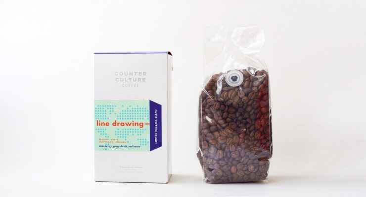
The boxes are manufactured down the road from our Durham, NC headquarters at a company called 3C!—an amusing coincidence. The bags inside the boxes are low-mil plastic from our bag manufacturer, Pacific Bag.
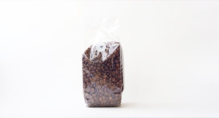
For package nerds, what *type of package* is it?
A paperboard box with a one-way valve bag.
Is the package recyclable? Any other pro-environment info about the package you want to share?
The version of the limited-release paperboard box we’re using now is made of greater-than-50% recycled material and is, of course, recyclable. The inks are linseed oil based. The bag inside is not recyclable, but is a much lighter-weight bag than would be required without the box. The intended result is that less material ends up in a landfill. We initially approached it like a cereal box, but, at this point, we’re still sorting out resealing options.
Nice Package is a design series on Sprudge by Zachary Carlsen. Want more Nice Package? Grok our archives.
The post Nice Package: Counter Culture Coffee, Durham, NC appeared first on Sprudge.


