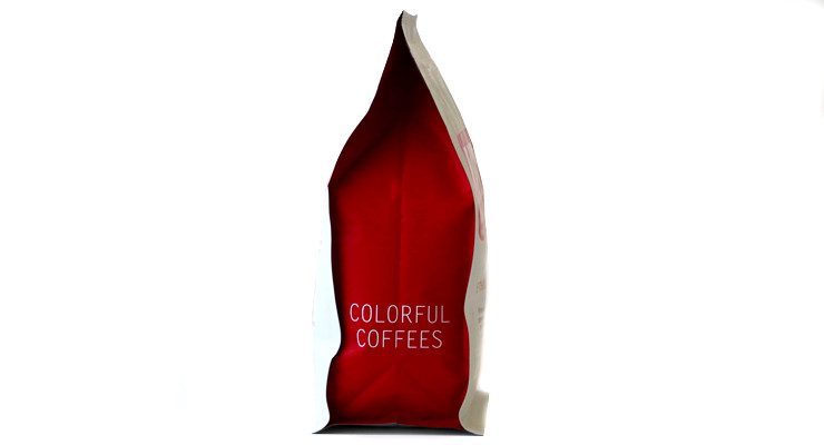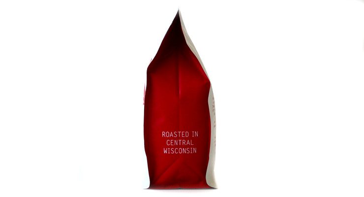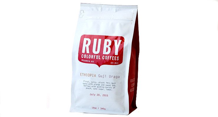
Ruby Coffee Roasters, a microroastery in the heart of Wisconsin, has in its few short years of operation flung itself—mostly through the mail—into the hearts of America. Former Intelligentsia and Ladro roaster Jared Linzmeier’s endeavor to build a true mom-and-pop roastery in his ancestral lands of America’s Dairyland have been quality focused throughout, from sourcing, to the handsome buildout of their newly opened tasting room in Nelsonville, Wisc., to this, their new, lively and delightful bag to put coffee beans into.
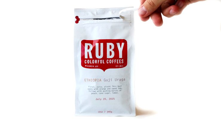
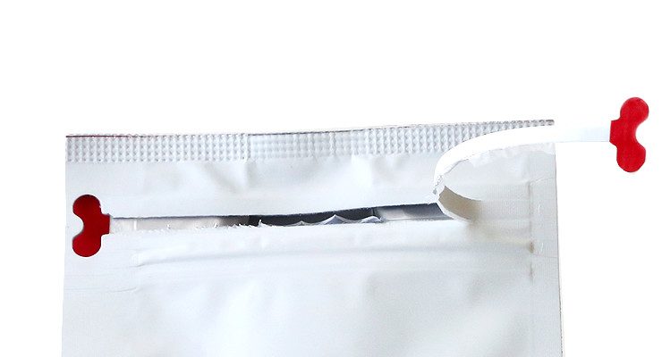
You’ll note not only a refined visual oomph, here, but life-changing convenience as well: the front-zipper-open closure that Intelligentsia so blew our minds with that we gave them a Sprudgie Award for making us feel less like the klutzes we are. This package both stands up on the counter and stands out in a crowd, and we spoke with Ruby Coffee founder Jared Linzmeier to learn more.
When did the coffee package design debut?
The design made its debut Monday, July 20th.
Who designed the bag?
The initial logo and direction was designed by our friend Matt Wignall out of Long Beach, CA. My wife Deanna has known him for eternity and he really understood our vision for the initial logo: fun, classic, simple. He doesn’t do much product branding, which I think actually helped him have a clearer vision for our needs. I worked with another friend, Sierra Serafica (Madison, WI) to build that design into the new packaging and to make it all cohesive.
Any design highlights you want to share?
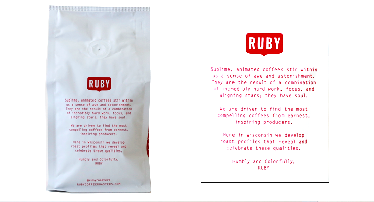
The logo type has some subtle hand-touched detail that I feel is a nod to our style of roasting: precise and intentional, but soft as well. The red we use on the side panels and throughout the rest of the package is Pantone 7621C. The font is Letter Gothic Standard. We are using a block bottom bag style with the addition of a resealable zip closure on the front. We print coffee info on the front using a clear label and, on the back, we’ve added a brief ‘manifesto’ sort of thing where I included a few words about what inspires us.
Please describe the look in your own words!
I love it. I believe the look and overall presentation is earnest (a word I use on the back of the package too), clean, concise. The Ruby badge pops a little more because of how it’s printed on the bag with a gloss finish (while the rest is matte), which makes it noticeable even from across the room. We moved some of our other info to other parts of the package and freed up more room for the coffee info to open up a little on the front. All of the design elements align with our philosophy for sourcing, roasting, and presentation.
What coffee information do you share on the bag? What’s the motivation behind that?
On our labels we share the name of the country and the producer of the coffee. Depending on the country or producer that info may be more specific or less. In the case of Ethiopia, for example, some of our coffees just carry the name of the mill or cooperative while in Guatemala the name represents the farm or individual. In our descriptions of the coffees we often mention the name of the specific producer (if available) or more detailed info on the part of the country the coffee comes from and what flavors/notes we think are most prominent. Our approach to writing descriptions and providing info is to be concise and create a feeling of approachability. If someone wants more details about elevation, cultivar, processing, etc., that’s usually available on the website. Basically, I thought: ‘what information do I consider when I’m buying coffee?’
Where is the bag manufactured?
The bags are made in Taiwan.
What *type of package* is it?
It is a multi-foil bag with a one-way valve on the bag and is lined with foil to preserve freshness over time.
Is it recyclable?
Like most high-barrier foil bags, the layers would have to be separated in order to be recycled and most municipalities aren’t set up for that. However, because the bag is a custom size specifically for 12 oz/340 g, we were able to reduce our packaging use by about 20% compared to our previous packaging. The new bags really help improve our efficiency. Because we aren’t using the tin ties anymore, that cuts out one step in production. We just heat seal the top of the bag and it’s ready to roll.
Nice Package is a feature series by Zachary Carlsen on Sprudge. Look at more nice packages here.
The post Nice Package: Ruby Coffee In Nelsonville, Wisconsin appeared first on Sprudge.


