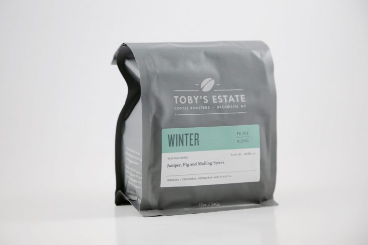
The story typically goes one of two ways when it comes to good branding: either a brand is working with a capable design firm, or has someone on staff capable of doing professional quality work. This nice package from our friends & partners at Toby’s Estate in Brooklyn is a little bit of both, the combined result of expertise from a design firm and original illustrations from a talented staff member. The overall goal, Operations Manager Misha Epstein tells us, was to create a new packaging identity for Toby’s in America that felt “sophisticated and friendly.” Mission accomplished.
As told to Sprudge by Misha Epstein.
When did the coffee package design debut?
Our new retail packaging debuted in November 2015. In the past year, we have launched a ready-to-drink cold brew line as well as redesigned our website, so it was only natural to update our roasted coffee packaging to fit that new design aesthetic.
Who designed the package?
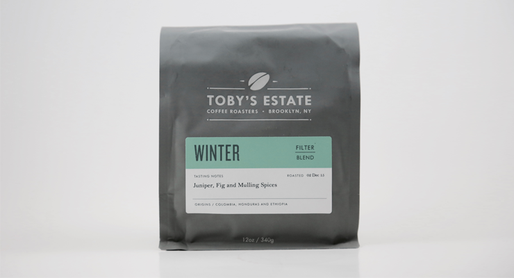
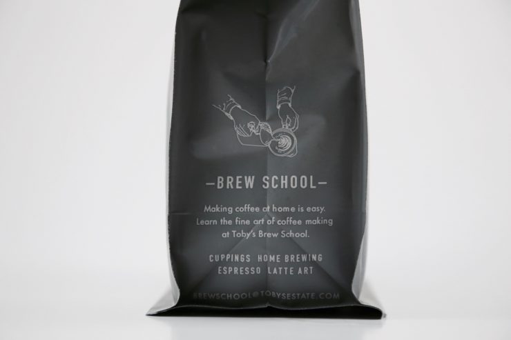
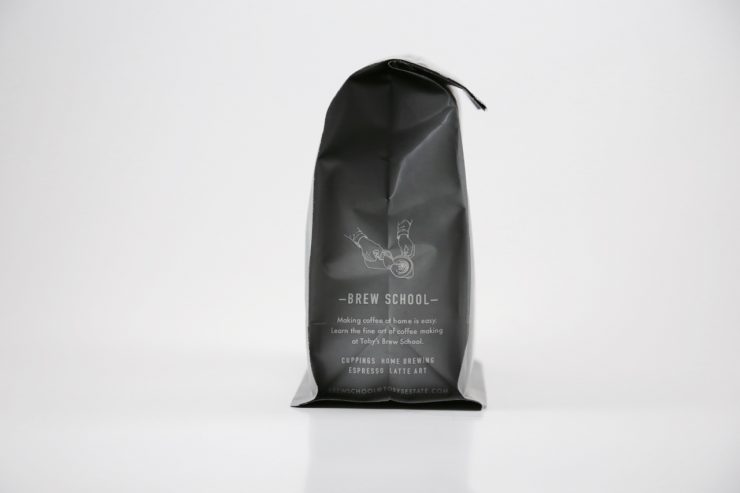
We worked with Drew Heffron of Practical People to get the design just right. We have been working with Drew for a number of years on our product packaging, as well as our website relaunch, brew school, and informational materials. Our brew school illustration on the side panel comes to us from our illustrator and barista Justin Buschardt. Justin has done a whole series of coffee illustrations for us, and we were excited to include that detail on the bag.
Please describe the look in your own words.
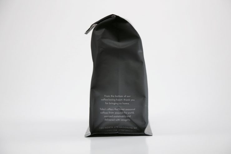
Our new packaging is designed to be sophisticated and friendly. We began receiving feedback from our customers wanting to preserve the freshness of their coffee, which is what first got us looking for a resealable feature.
What coffee information do you share on the package? What’s the motivation behind that?
The labels are designed to allow our customers to interact with them as much, or as little, as they prefer. We want our coffee to be accessible to everyone so we prominently display the coffee’s origin and farm name, and include producer, region, variety, and process information at the bottom. If people are interested in the supplemental information, we love to have conversations with them about it, but if someone is just looking to pick up a great Brazilian or great Colombian coffee, we want to make that process just as easy and enjoyable for them as well. Since the majority of the people enjoying our coffee are New York-based, we also wanted to highlight our brew school.
Where is the bag manufactured?
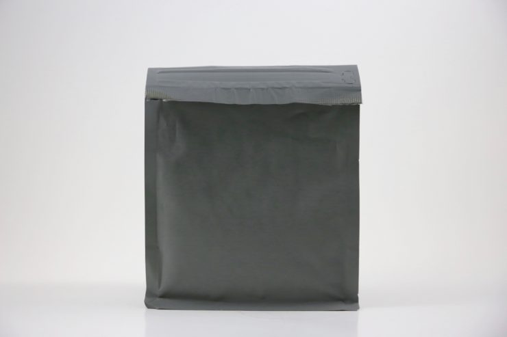
The bag is manufactured by Pacific Bag Inc., and the labels are sourced from Seattle and printed in-house.
For package nerds, what type of package is it?
The bags are block bottom, with a one way de-gassing valve and a resealable zipper. We wanted to create a bag that would display beautifully on a shelf, and the block bottom bag was really the direction we needed to go to achieve that. We also wanted to offer our customers the ability to keep their coffee fresh with the zipper.
Nice Package is a feature series by Zachary Carlsen on Sprudge. Look at more nice packages here.
The post Nice Package: Toby’s Estate, Brooklyn appeared first on Sprudge.

