Every brand has its own approach to coffee packaging design, but here at Nice Package we see a trend emerging: progressive coffee companies are increasingly seeking out the services of talented design agencies to creative distinctive, memorable packaging. Typically neither brand in these unions are particularly large; collaborations between small, progressive coffee brands and boutique design firms are just one more example of how well coffee plays with stand-outs in fields like fashion, art, music and tech.
In a small market like Chattanooga, Tennessee these connections are even more important, like the work being done by Velo Coffee Roasters and the design team at Widgets & Stone. Together they’ve created a packaging presentation that feels distinctively memorable, and able to convey both complex information and a sense of brand personality in the same breath. “We hope you dig it.”
As told to Sprudge by Spencer Perez.
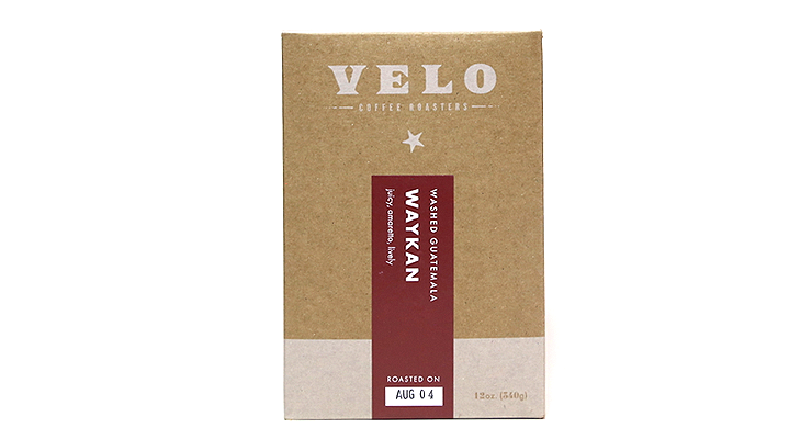 When did the coffee package design debut?
I guess about three and a half months ago.
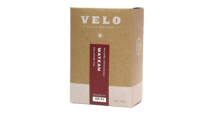
Who designed the package?
There was a lot of conceptualizing and direction on our end, but Travis Hitchcock at Widgets & Stone really helped us flesh it out. This was his second freelance project with us and we’ve kept him around. Really solid guy and a talented designer.
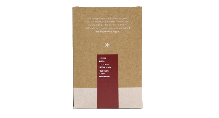
Any design highlights you want to share?
The blue, red, and white labels convey increasingly complex flavor profiles and look really sharp on the shelf. Other than that, there’s nothing particularly special about the package, except that this design is the sum of a million tiny, significant details that make for a really efficient, beautiful whole. And that’s special to us. No one will or should ever know how many elements were moved just a little that way or made just a little smaller to nail the vibe we were going for.
Please describe the look in your own words!
Vaguely nostalgic. Warm. Efficient. Tennessean.
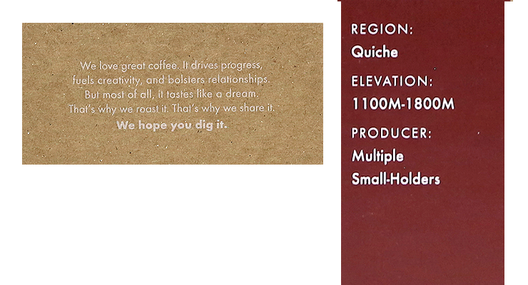
What coffee information do you share on the package? What’s the motivation behind that?
The roast date is front and center. Above all else—the producer, our company logo, our copy—we put primary visual emphasis on the lot name. The process and nation of origin come next. The three tasting notes are lowercase so they’re subservient to the other elements in size, but not necessarily in impact. We try to pick one descriptor for first impression, one for mid-range flavor, and one for overall impression.
We think those four elements help most people into a coffee they’ll enjoy. Packages get so beat up being handled off of and back onto the shelves. The box helps with that, too.
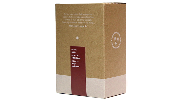
On the back, we’ve got the growing region, elevation, and producer, respectively, for people who want to get a little more into terroir and provenance.
Where is the bag manufactured?
The box is cut and printed in Canada. If you want to print white on kraft, be sure to get redundant proofs, and nail down that board stock.
For package nerds, what *type of package* is it?
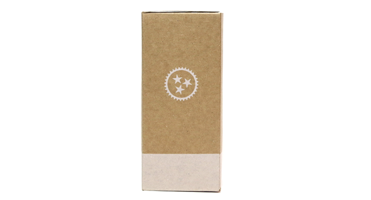
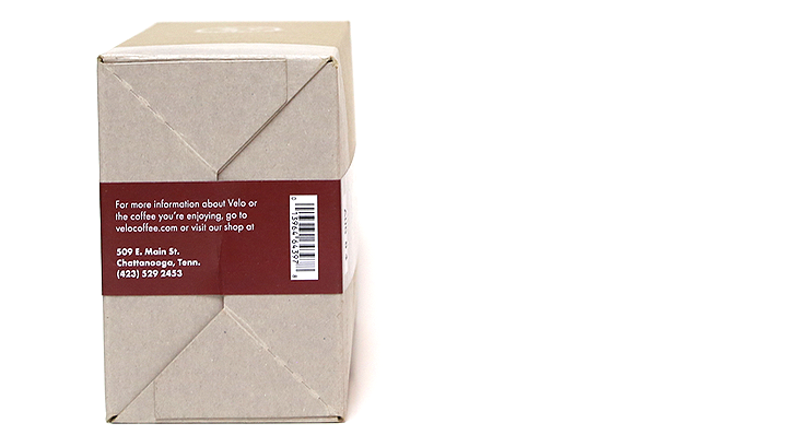
This is an 18pt Auto-Bottom Tuck-End box with a valved inner bag. We put a rubber band in every box so you can keep your stash fresh.
Is the package recyclable? Any other pro-environment info about the package you want to share?
The box and bag are recyclable and the rubber band is compostable. Nothing like rubber funk for healthy ‘maters. I actually don’t know if that’s true.
Nice Package is a feature series by Zachary Carlsen on Sprudge. Look at more nice packages here.
The post Nice Package: Velo Coffee Roasters of Chattanooga, Tennessee appeared first on Sprudge.

