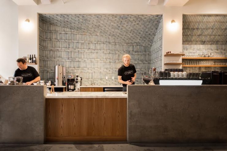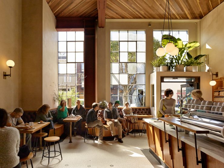
Sightglass Coffee 20th Avenue, San Francisco. Photo by Matthew Millman.
Here’s a short list of some of the Bay Area’s most recognizable coffee shops: Sightglass, Ritual, Four Barrel, and Equator Coffees & Teas. From the outside, it’s pretty easy to pinpoint what might be similar about these roasters—they are all fine purveyors of specialty coffee who’ve made names for themselves as respectable and skilled craftspersons, and helped set the stage for the now expansive and fantastic coffee scene the Bay Area hosts. Beyond that though, each of these coffee roasters have opened cafes that are known for the aesthetic and architectural quality of the actual spaces. You don’t just walk into a Four Barrel or a Sightglass for a cup of joe, you come to admire the stunning environment. For this, you can thank Seth Boor and Bonnie Bridges, the principal architects at Boor Bridges Architecture and the collaborative geniuses behind some of the defining cafes of the Bay Area.
Starting with the Ritual cafe in local gardening mecca Flora Grubb (also a Boor Bridges design and concept), Boor and Bridges have helped to create and refine the aesthetic for the modern coffee shop in San Francisco, and beyond. With a focus on always creating a “pleasing, sustainable space” which highlights elements of the pre-existing space, the duo, and their talented team, have raised the bar on what being a “cafe” means. I sat down with Seth Boor in their simple and tasteful office in the Tenderloin to talk about their process, their history, and the connection between coffee and architecture.
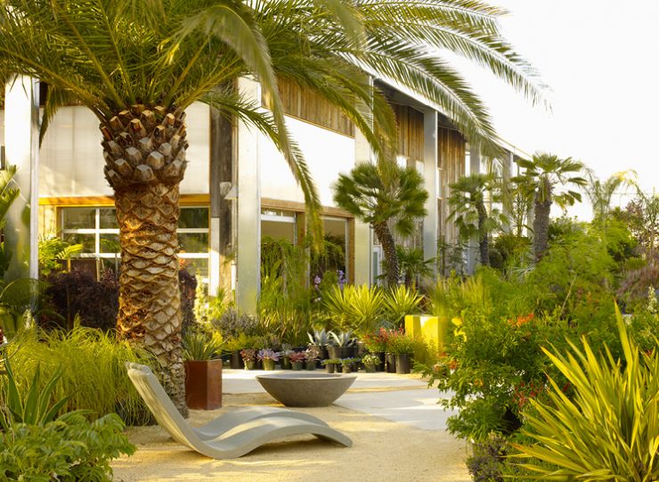
Flora Grubb Gardens, San Francisco. Photo by Sharon Risedorf.
How did you guys end up designing cafes?
We sort of just happened into it. We were doing Flora Grubb Gardens from the ground up, and they wanted to put a cafe in. Flora was a good friend of Ritual’s Eileen [Hassi]. We met, and she was still partners with Jeremy Tooker [now Four Barrel’s owner] at the time. Eventually, Jeremy went off on his own and did Four Barrel on Valencia. And it just went from there.
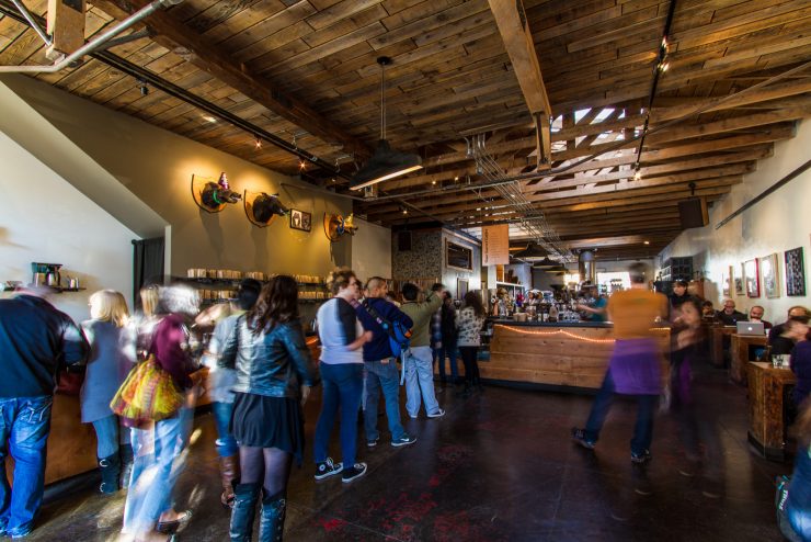
Four Barrel Coffee, San Francisco. Photo by Boor Bridges Architecture.
Where did the idea behind the Four Barrel space on Valencia come from?
Jeremy approached us after we’d worked together on the Ritual kiosk and said that he had a vision—he wanted to treat coffee like a winery treats the production of wine. They wanted to showcase the roasting process. They wanted to create and define the space so the roasting drove the retail. We called what they did the hunter/gatherer design approach—they’d just find random stuff in the world, and be like, “let’s use this.” It became this collaborative process of them finding junk and us integrating it into the space.
Why do you think cafes continue to excite you guys?
Places like Four Barrel and Sightglass are exciting because we get excited about people who actually make stuff. Both of them had this sort of industrial production nature and you could see it in the technological aspect of actually roasting coffee. It wasn’t just retail. It was making stuff. Coffee people are like chefs in that they treat their product as much more of a craft than just a product.
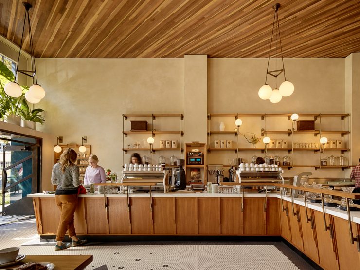
Sightglass Coffee 20th Avenue, San Francisco. Photo by Matthew Millman.
How has your approach changed or evolved as you’ve done more and more cafes?
It’s more that we’ve learned about more possibilities than it is that we’ve narrowed it down to how we should do it. You know, we’ve learned a ton, but we try to forget a bunch.
We’ve learned about flow and how people, especially in the US, approach a cafe. How they line up, where they want to go after that. Most of the cafes have similar menus, espresso, and drip and all that, and the design aspect is how you move people through that menu.
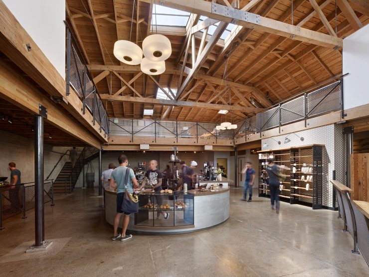
Sightglass Coffee, San Francisco. Photo by Bruce Damonte.
How did you differentiate between the Sightglass on 7th Street in South of Market and the newly opened space on 20th?
In all our projects we try to balance the cozy and giant, heroic spaces versus more human spaces. Sightglass on 7th was going to be their production space and once we peeled stuff away we fell in love with the character and scale and industrial aspect of it. We wanted it to be about roasting and less about the retail space. On 20th, the space we had didn’t have as much character to it on its own. We wanted more polish and finish to the space, because it wasn’t a production roastery, it was a neighborhood roastery. We wanted the scale to come down to a more human level.
Tell us about the idea behind your space on Market, Mazarine.
Mazarine is a beautiful space inside of a slightly hard to love building. It was about creating a different kind of environment, where it’s not about roasting—it’s about the retail experience surrounding the craft of coffee. It was named after the Bibliotheque Mazarine and that’s what the aesthetics are about. It’s about letting people in and letting them stay.
Do you have a special connection to any individual cafe you’ve worked on?
We get excited about all our different clients and all the different spaces we go into. What takes us to these jobs is that we can see potential in all the places and all the designs. That said, the trio of working with Ritual, Four Barrel, and Sightglass, well, for me those were my formative projects. They’ll always have special places in my heart.
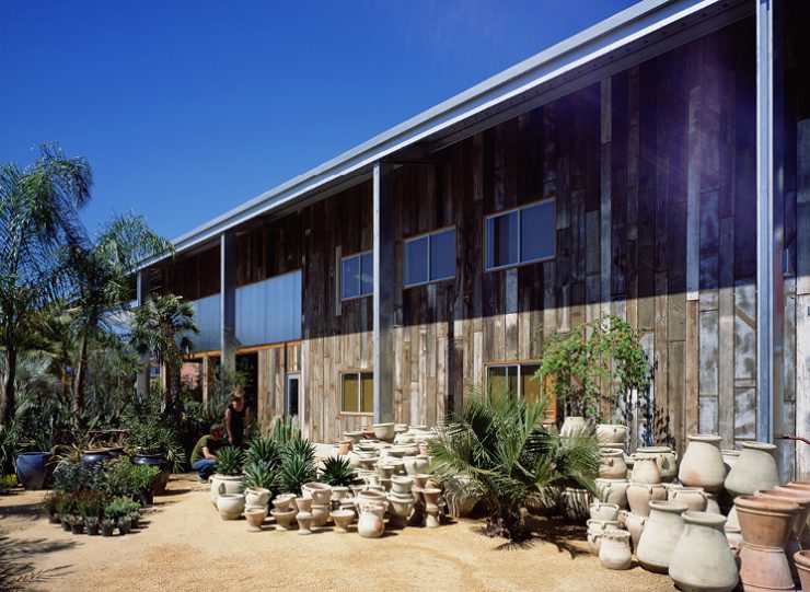
Flora Grubb Gardens, San Francisco. Photo by Sharon Risedorf.
What do you think connects coffee and architecture?
Two reasons: one, that idea of craft and craftsmanship has always been a huge driver. That sort of craft and level of presentation drives beautiful spaces. Two, simplicity. For the most part cafes are fairly simple—coffee and water and maybe a few different ways of doing that. That’s what attracted me—the simplicity and the dedication. And that’s the reason why it’s become so architectural—the simplicity allows you to aesthetically showcase the craft in a design sense.
Noah Sanders is a Sprudge.com staff writer based in San Francisco, and a contributor to SF Weekly, Side One Track One, & The Bold Italic. Read more Noah Sanders on Sprudge.
All photos provided by Boor Bridges Architecture.
The post We Interview Boor Bridges Architecture, San Francisco’s Cafe Design Masters appeared first on Sprudge.


